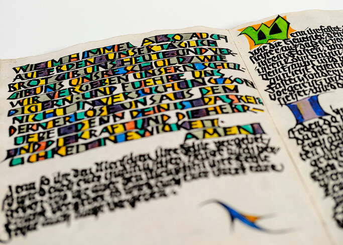
Our growing archive is available to view on demand. The quality of the recordings is variable – some are excellent in both sound and video quality while others, particularly the older recordings, are less so. Once purchased a recording is made available for your personal use to watch and rewatch for up to one week following payment.
Non-member (personal use) = £10
Full Member = £5
Associate Member = £7
Student Member = £2
For college and group use, please contact archive@letterexchange.org
Browse the recordings below or, search by speaker or filter by topic.
12 June 2024
An overview of the calligraphy and lettering of American graphic designer W.A. Dwiggins (1880–1956) from his roots in the Arts & Crafts movement to Art Deco-influenced lettering and idiosyncratic scripts.
Paul Shaw has been researching, writing about and lecturing on the life and work of W.A. Dwiggins since 1977.
17 April 2024
From his Bristol-based studio, Jamie Clarke designs illustrative lettering projects alongside contemporary typefaces. Balancing these two letter-led, but distinct disciplines, has led him to discover an endless cycle of fresh ideas and new opportunities as well as giving him freedom that comes from switching between activities. In his talk, Jamie will share how his approach to drawing letters developed.
13 March 2024
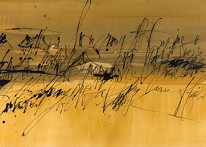
‘Writing and painting share a common source’ is a Chinese maxim. It is true of Chinese calligraphy and painting because both are executed with the brush. For Susie it is not so different. Having begun her lettering career with a pen, Susie has gone on to develop many forms of brush lettering before taking the brush further, into the realm of abstract painting. How have those beginnings in lettering influenced her painting? How does she now navigate between the two disciplines?
21 February 2024
My love of letterforms has developed throughout my career and how I use them has changed dramatically. As a corporate designer and art director working for luxury brands, such as Harrods and Condé Nast, through to my work as a printmaker in the Wood Words Letterpress Studio, I’d like to explore how I have used both digital and analogue typography to capture an audience, communicate ideals and to make art and how corporate constraints and artistic freedoms have affected my work.
13 December 2023
Over a long career starting in 1966 when he set up his own studio in London after 5 years working for his father David, Richard has undertaken hundreds of prestigious public and private commissions around the world involving lettering and sculpture in a wide variety of materials, some on a large architectural scale using innovative techniques. He has inscriptions in many public places including the Supreme Court, Parliament Square London, and in great churches and cathedrals around the country including St Paul’s and Westminster Abbey. Several successful letter carvers owe their training to Richard, who has also been awarded an Honorary Fellow of the RIBA.
11 October 2023
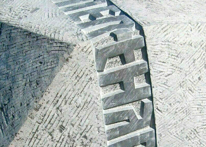
I've been a lettercarver for 45 years. The first dozen years as a trade lettercarver. I was then inspired by a slate carving I saw by Richard Kindersley. Set about the long journey to become an artist/lettercarver with a lot of help from Alec Peever and some from Suzanne Haines and Michael Harvey. I set up my workshop 25 years ago. I have had some amazing commission including The Great Court of The British Museum. I also designed 1 silver/gilt and 2 gold medal winning Chelsea Flower Show gardens.
14 June 2023
The way of letter creation, movement or stability, halftones or the solid black, and many other distinct characteristics of typographic and calligraphic letters are the fruitful field for exploration and insight.
Vera speaks about the properties of letterforms in type and calligraphy that she experiences in her projects. Opposites and similarities of these forms’ nature provoke new ideas to evolve in both fields.
Graduate of the Moscow University of Printing Arts, 2003, and the Type & Media course in The Hague, 2004, Vera Evstafieva is a type designer and calligrapher based in Cambridge, UK.
17 May 2023
Type design is an activity that goes beyond the mere creation of new forms to provide an increasingly saturated market of typefaces. As a specialized activity, it can contribute to a more inclusive dialogue within the framework of our global society. Typecraft Initiative organizes and develops workshops in which communities of artisans (mainly women) are involved to link their skills and expertise in drawing letters. A strategic aspect is to use these workshops as a way to introduce design methodologies to local communities in India.
19 April 2023
Many things can cause a change in design or working practice. These changes often have a positive influence on current and subsequent work. I predominantly take on commissions for individuals and families. Collaborating with clients to develop designs feels very rewarding. It leads to unexpected changes in direction, and can frequently spark exciting new ideas.
15 March 2023
I believe all things are creatively connected. All the books, pens, type, printing-presses, computers, paints, fabrics, postcards, empty cans, tools, rags, pigments, glasses, magazines, scanners, book-presses, yarn, threads, needles, nibs, brushes and all the other things I have forgotten to mention that are crammed into my studio. They are all part of my creative process together with the people you meet and places you go. In this lecture I will look at the red thread that connects them all in my professional life as a lettering artist and designer.
15 February 2023
A talk about the pleasure to be found in using commercially obsolete print processes to create typographic art; the delights of the analogue; and the ‘thingy-ness’ of books. Barrie Tullett is a lecturer and graphic designer who, for over thirty years, has been working on a project to typographically illustrate each Canto of Dante’s Divine Comedy using a different ‘commercially obsolete’ technology for each book.
14 December 2022
Being a lettering artist was never my plan. That was something my Dad did. My teenage toe-dip into calligraphy was swiftly deemed both extremely boring and way too difficult. But after career-ing off for 20 years exploring most corners of graphic design, I find myself today firmly fixated on drawing letters for clients around the world. My talk is about this journey, what it is about letters that keeps me coming back and my obsession with seeking out new (yet familiar) forms within the 26 pre-defined set of shapes that constitute the lettering artist’s ‘blank canvas’.
12 October 2022
Of all the crafts that William Morris undertook, his calligraphy was perhaps the most personal, his painted manuscripts being either for his own pleasure or as gifts to friends. The time, patience and detailed execution required for these writings contrast with a popular image of Morris as someone who didn’t have the temperament for such painstaking, repetitive work.
15 June 2022
Anything not formed in nature was designed by someone, and if one collects enough of one type of thing – books, movie tickets, candy wrappers, stamps – the story of their design can be discerned. Or a story can be made up. Either way, this series of short talks in the format of a peach kulcha (twenty slides each shown for twenty seconds) is about looking closely at things that are usually overlooked.
11 May 2022
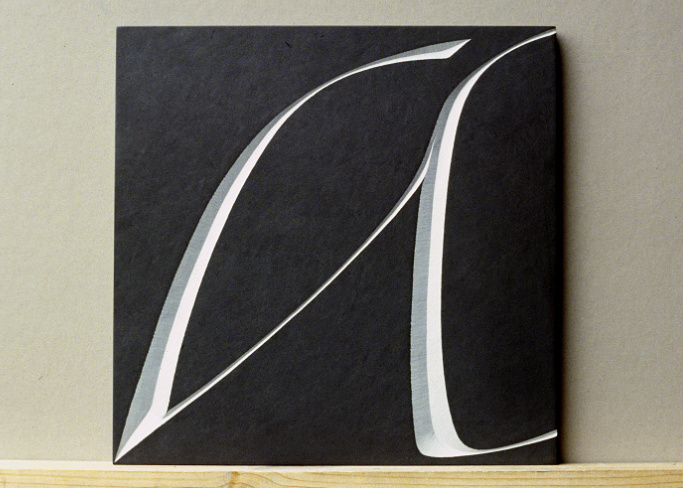
A look at the straight and not so straight forward output of Annet Stirling’s past decade, focusing on texture, pattern and words. Stone and dust, chisels and dummies, pencils and rubbers, lasers and illustrator, letters and spaces, reading and deciphering. Annet Stirling trained as a graphic designer in the Netherlands, studied lettering at the City and Guilds of London Art School with Berthold Wolpe, then worked for Richard Kindersley. She has been a letter designer and carver for 40 years, In 1988 she formed Incisive Letterwork with Brenda Berman, focusing on large-scale architectural inscriptions and ‘word sculpture’. They worked together for 20 years and had several solo exhibitions exploring the boundaries of legibility and abstraction in letterform. At her Amersham studio Annet Stirling makes exhibition pieces alongside headstones and commercial commissions, and her work is on buildings all over the country and Europe. She has co-curated two exhibitions at the Lettering Arts Centre, is treasurer of Letter Exchange and a member of the Buckinghamshire Craft Guild.
13 April 2022
“The making of letters in any form is my purest and greatest pleasure.” (Rudolf Koch). The Klingspor type foundry in Offenbach still stands for innovative type design in the first half of the 20th century. At the end of the 19th century, Karl Klingspor established in the small company the idea of perceiving type design and typography as an artistic process and increasingly commissioned artists to develop new typefaces. From 1906 onwards, Rudolf Koch (1876–1934) in particular was one of the most innovative and productive type designers at the foundry and continues to inspire today in the special variety of his works. Since its founding in 1953, the Klingspor Museum has housed a large legacy of type specimens, process material and artistic works by Rudolf Koch, which continue to shed new light on a creative life. The alert eye that Koch had on his surroundings and the social ideas of his time is reflected in his designs, drawings and calligraphies. They tell the story of a life and also the story of a conflicted society. Dr. Dorothee Ader, director of the Klingspor Museum, talks about Rudolf Koch’s extremely versatile work in the mirror of his time.
16 February 2022
It is a well-used cliché to describe a male lettering artist as a Man of Letters but, in the case of Will Carter, it is appropriate. Although he was once reported as saying “I don’t read books, I make them.”, he made many classics as well as designing several typefaces and developing an immediately recognizable style of lettercutting in both wood and stone but it is his bookjackets which are the real surprise.
15 December 2021
In a lifelong pursuit for the meaning of craftsmanship Gary has spent a good deal of his 30 year career doing things other than lettering for which he is known; from blacksmithing to flintknapping, he has worked as a landscape designer, an archaeologist and as a boatbuilder. Every new interest has informed his lettering aesthetic, growing into a belief that all craftsmanship is rooted in a few simple principles that form a personal manifesto on the nature of good design.
17 November 2021
The pandemic radically changed our way of living and learning upside down, and with it our way of learning and teaching. Our way of being together doing art has had to change. Massimo discusses his point of view on this topic, showing what he has done and discovered in the preceding year and a half of online teaching, also trying to stimulate discussion by imagining what our near future could be like.
3 October 2021
Tony Lewery invites you to look at and enjoy some sub-sections of the signwriting trade where the lettering is as much part of popular art as industry, and is sometimes even part of a modern folk art. Letterforms and traditional treatments are a visual language that express much more than just the meaning of the words.
12 May 2021
Pat talks about the challenges of printing books by letterpress and specifically his most recent publication 2020 Vision – a collaboration with the Society of Wood Engravers featuring work by 20 of today’s best known engravers – which uses some 100 year old blocks. Pat also talks about growing up at the Whittington Press started by his Dad in the 70’s as well as some words on Anna Parker, the printer of 2020 Vision, who has to an extent, changed the way he works.
14 April 2021
With over 2000 cuttings from medieval and renaissance manuscripts, the V&A holds one of the largest collections of this kind in the world. This giant jigsaw is made of individual letters, snippets of decorative borders, cut-out miniatures, and full pages taken out of the manuscripts they once adorned. This talk will explore the history of this collection assembled in the late 19th and early 20th century, and look more closely at a few chosen examples.
17 March 2021
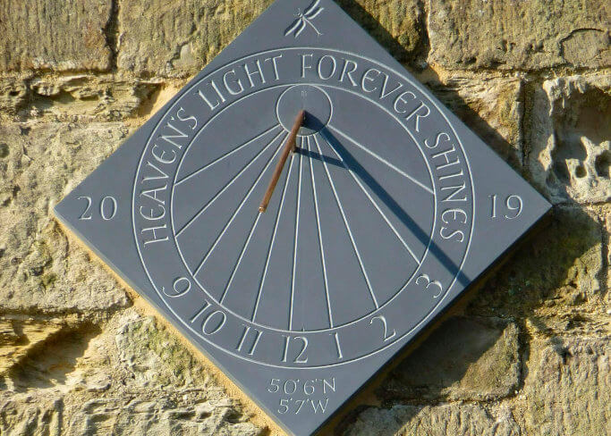
Lettering and sundials have a long association almost to when dials were first made – numerals, dedications and mottoes. Typographers, calligraphers and carvers have almost every skill needed to make fabulous sundials. In his talk, Ben hopes the illustrations show how sundials work and how simple it can be to make them.
17 February 2021
Tim is a calligrapher, lettering artist, teacher at Falmouth University and author of Shapes for Sounds.
16 December 2020
Philip talks about his sculptural work, mostly low relief carvings in stone. He illustrates the progress of his work from art school at City & Guilds to the present day, following themes and discussing successes and failures.

18 November 2020
Jean François talks about his passionate belief in the importance of communities, as shown by his commitment to a number of industry bodies, serving as President of the Association Typographique Internationale from 2004 to 2007 as well as being a board member of the Club des Directeurs Artistiques in Paris and member of the Type Directors Club in New York.
14 October 2020
Ieuan discusses his working life. The change from calligraphy to lettercutting, memorials, teaching and the future.
12 Febraury 2020
James talks about a kind of traditional lettering that was once everywhere: stone cutters used it for the names of important buildings and the monuments in graveyards, songwriters put them on pubs. These were ‘working’ because on signposts they told you clearly where you were and where you were going. Perhaps inevitably, the trades that used these letters went digital, and skills were lost that could and should have been kept alive. In my talk I show not only something of what we have lost but also splendid examples of what we can still save, and should do so while we can.
11 December 2019
Manchester-based Stephen has made a career from drawing, writing and designing the alphabet. He will show examples of his collaborations with poet Carol Ann Duffy, coin designs, lettering for book covers and much more.
16 October 2019
Some calligraphy, a little letter carving, and even a tiny bit of typography, or thirty-five years of avoiding work. These three disciplines I think of as aspects of one thing, finding form for text. Calligraphy is of these by far the most subtle and expressive, since all elements are under the control of the designer, a greater latitude may be permitted to the forms of the letters than in stone, and the execution relies on the hand alone.
15 May 2019
Whilst workign as type designer at Monotype, Toshi revived and digitised several lesser-known typefaces by the man famous for Albertus.
12 June 2019
‘I have always been curious about the expressive possibilities of lettering so I’ll be looking back at the varying ways in which I’ve had the chance to explore this approach to my work, and how it is now leading me into the world of illustration and printmaking.’ Pip Hall explores the relationships that accompany and enrich her work, especially through collaboration with writers and fellow makers. There are stories of carving in unusual places, of interaction with the public, and the answer to their one perennial question for letter carvers.
13 February 2019
Ivan Chermayeff was modernist royalty in the USA, son of a famous architect and teacher. He chose graphic design and had a successful 60 year partnership with Tom Geismar, his classmate from Yale, with work that included corporate identity, book design, posters, exhibitions and campaigns. Although he was born in London, Chermayeff’s work was never well known here. Classical in its restraint, his work, especially his private collages, have wit and humour. His posters are never overloaded with information, but catch the eye and stay in the memory.
14 November 2018
Robbie talks about his lettercarving work and his more recent sculptural pieces.
13 June 2018
Rachel and American lettering designer Michael Clark have been working in collaboration for five years to produce unique pieces of lettering: our ‘trans-Atlantic co-conspiracy’. Rachel talks about how this very creative and rewarding partnership started and shows the numerous pieces of work produced. How they were conceived, practical problems of working together across thousands of miles, the challenges of trying new styles and the rewards of working in collaboration with a like-minded friend and colleague.
11 April 2018
After years learning to carve a perfect letter, I find I am less and less interested in perfection, but finding a balance between a free and spontaneous approach and a degree of formality is a much harder task than I initially realised.
14 March 2018
You want me to do some work for you – if it has to do with letters, I’m fine with it. So, yes – “As long as it’s about letters, it’s ok by me”. That might describe what Andrea Wunderlich’s favourite thing is. She is a calligrapher creating art pieces that are shown in Europe and worldwide. And she teaches. As a lettering artist, she designs logos and works in graphic design. She has a lot of fun developing huge wall calligraphies. Those can be free art pieces or sign painting.
21 February 2018
I try to put joy into every project I do. Designers have the ability (or responsibility) to produce work that is thoughtful, engaging, beautiful, playful, impactful, surprising, challenging, rewarding and meaningful. That’s a lot to ask, but it’s what makes it worthwhile – for the designer, the client and especially the audience. I want to show and talk about recent studio projects where I’ve tried to do this – and talk about the process, the pitfalls, and the rewards.
13 December 2017
A few days in Rome with Hazel Dolby in 2012 began a body of work commemorating people whose names are recorded but about whom we, and history, know virtually nothing. Our collaboration, in which we record, make and evaluate, has become for us a far wider exploration of themes of life, death and remembrance. This talk shows some of the source material Hazel and Sue saw, the work they made and describes the rationale behind what they have done and continue to do.
18 October 2017
With images from his own and others’ work, Alan shows the use of alphabets and type as a means of evoking the spirit of the letter and word.
10 May 2017
In this talk, Charles Gurrey will try to say what his approach is, as a sculptor, to working with text: “Taking stock of what I have done so far, perhaps I can see a common thread or purpose in my approach, not unrelated perhaps to my other areas of work with figuration and abstract work. The questions of the scale, material, form, and layout of lettering, all are completely integral for me, as are those of the purpose, context and siting of the commission. Also, I don’t like to repeat myself!”
12 April 2017
Peter Grundy AKA Grundini, grapples with modern messiness by designing simple, shared and accessible architectures of the future. In this talk, Peter will explain what this means by looking back at a career developing an iconographic visual language that draws more from the rules of type and letterforms than it does from traditional life drawing. He applies his distinctive visual signature to projects where creativity is paramount, taking information design and illustration into new areas such as campaigns and public space images.
15 February 2017
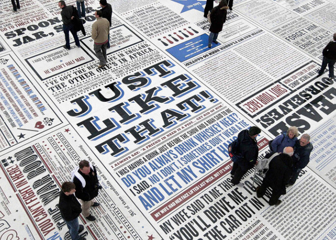
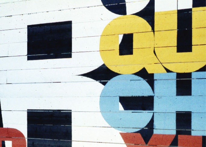
Andy Altmann takes a look at some of Why Not Associates’s diverse output before taking in detail about the design, manufacture and installation of the Comedy Carpet. Designed in collaboration with artist Gordon Young and sited in front of the iconic Blackpool Tower, the Comedy Carpet is a public artwork that celebrates British comedy on an extraordinary scale. Referencing the work of more than 1,000 comedians and comedy writers, this 2,200m² work of art contains over 160,000 granite letters embedded into concrete, pushing the boundaries of public art and typography to their limits.
14 December 2016
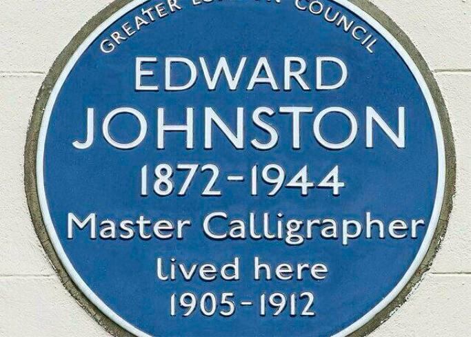
Edward Johnston almost single handedly revived the art of formal penmanship. His work, Writing and Illuminating, and Lettering, published in 1906 and in print ever since, created a new interest in calligraphy and a new school of excellent scribes. The life he breathed into this ancient craft and its continuing tradition even in today’s hi-tech world can be ascribed to his re-discovery of the influence of tools, materials and methods.
18 May 2016
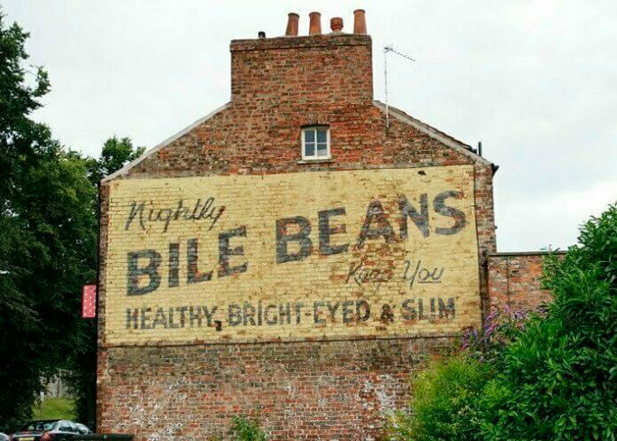
Fading on walls across the world are the ghost signs of advertising past, still whispering the slogans of old. Once brightly coloured and promoting everything from Black Cat Cigarettes to Hovis Bread, these painted signs are now ‘ghosts’ of their former selves. Since 2006, Sam has been photographing and archiving these ghostsigns. He gives a brief history and shares the stories that these signs tell.
13 April 2016
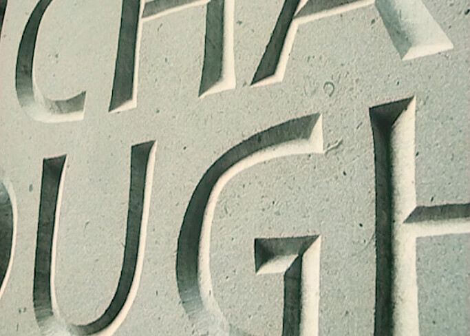
For the past forty years Tom Perkins has worked as a designer and maker of carved inscriptions in slate and stone. Tom has a deep interest in fusing contemporary and classical idioms and he has experimented extensively with letterform. He will show some of his contributions to the evolving design of letterform.
11 November 2015
Andrew Whittle was born in Dorset (1952) and has never escaped. He has been cutting (or is it carving?) letters since a brief apprenticeship on the Isle of Portland in 1974. The lecture focusses on his work making memorials rather than art or architectural projects. This work is central to the living of many lettercutters but often overlooked in favour of more prestigious and less morbid artwork. Andrew hopes to demonstrate that these commonplace sculptures can be the focus for a celebration of love and even an occasion for comedy.
20 May 2015
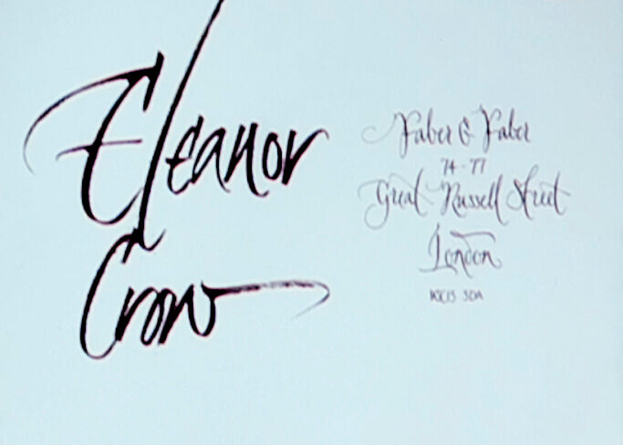
Eleanor Crow, a senior cover designer at Faber & Faber, takes an overview of book cover lettering from across the firms eighty year history, using examples from its distinctive archive as well as more recent commissions.
18 March 2015
Edward Wright (1912–1988) was an artist of diverse skills: a painter, a maker of collages and reliefs, a printmaker, and sculptor. Ann Pillar first encountered Edward Wright as a fine art student and in 2013 she completed a doctoral thesis on him. Fascinated by his lifelong interest in communication and obsession with the meaning which marks can offer, whether by intention or incidentally, this talk explores the paradoxical nature of Wright’s lettering works, produced from 1959 to 1986. No distinction is drawn between his public and private works, for in both fields Wright valued the creative element of play, and the rules and rituals which a process brings to the game. The aim is to show how, in Wright’s works, the gesture does indeed go before the word.
14 January 2015
Steven shows examples of work from throughout his career, including cartoon strips, books, posters and animated films. He discusses his hand-drawn, wonky, out-of-kilter and listing lettering. And how this adds atmosphere and character to his work. He elaborates on his obsessions which help to draw out whatever idea or theme he’s developing. Plus, it’s always fun to mess about with words.
Steven Appleby is an absurdist cartoonist and the creator of comic strips, radio, theatre and the animated television series Captain Star. He has published over 25 books and his paintings and drawings have appeared in numerous gallery exhibitions and, notably, on the Pixies’ album Trompe le Monde. He lives, works and daydreams among his unusual family in London.
17 December 2014
After teaching classical languages for 25 years, Yves Leterme decided to switch careers and become a freelance calligrapher and letter artist. After his introduction to lettering in 1991, he became hooked and followed in the way the winds blew him. From the beginning Yves developed a special interest in the so-called ‘gestural writing style’, a topic he now teaches worldwide. His first book, Thoughtful Gestures, addresses this contemporary style and features a theoretical approach of the matter as well as many examples. He talks about being a freelance calligrapher in Bruges, the very thin line between work and leisure and his latest projects such as the Litterae project.
11 December 2013
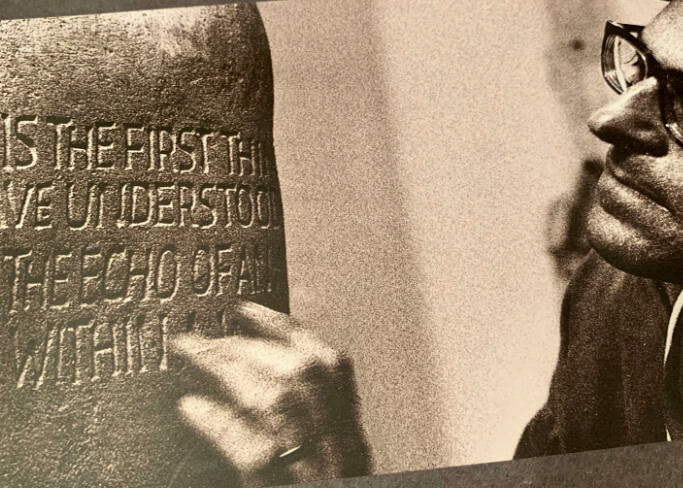
Ralph Beyer, who died in 2008, was a founder member of Letter Exchange and most famously responsible for the Tablets of the Word in Coventry Cathedral. In this talk John Neilson will look at the range of Beyer’s work, at the background and influences which shaped it, and try to tease out its qualities and what, if anything, they can tell us now. Beyer’s output ranged through public and private commissions to the poetic texts he carved later in life, and included ventures (generally less successful) into type design. His father was a friend of Rudolf Koch, and Ralph’s childhood in Germany, then in exile during the rise of Nazism, was fundamental in forming his artistic outlook. Taken on by Eric Gill on his arrival in England as a refugee, he learned lettercutting and then became, briefly, a student of Henry Moore. After the war and a short spell with David Kindersley Ralph set up as a freelance lettercutter – the career he pursued for the remaining 55 years of his life.
16 October 2013
Brody Neuenschwander will show recent work in many media and talk about how he films the pen in motion. Brody studied art history at Princeton University and the Courtauld Institute. He also studied calligraphy under Ann Camp and Gaynor Goffe at Roehampton Institute before working for one year as assistant to Donald Jackson. He lives in Bruges, Belgium, which is an excellent base for projects all over Europe. His work finds its way into a wide range of media, from sculpture and installations to films, videos and internet situations. Brody is not sure if he is an artist or just a calligrapher, but he works from the heart, trusts his intuition and is not afraid of problems and failures. He is currently working on several exhibitions and a television series.
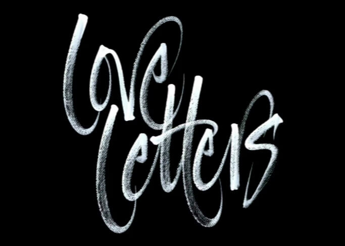
2006
Love Letters is a short 20 minute documentary featuring interviews with and demonstrations by leading Letter Exchange Full Members. It’s an introduction to what we do at Letter Exchange and is a fascinating insight into why our members are so passionate about lettering in all its forms.
This is a set cost of £2.00